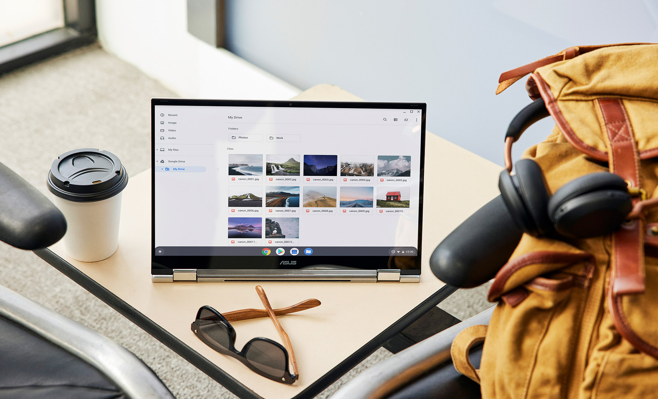
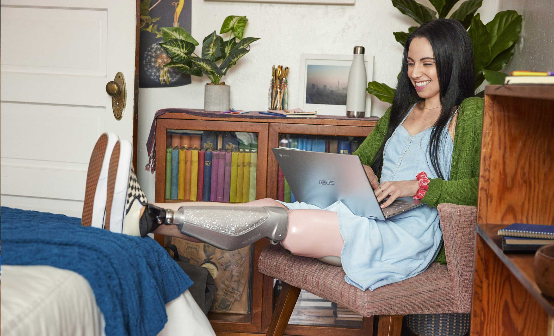
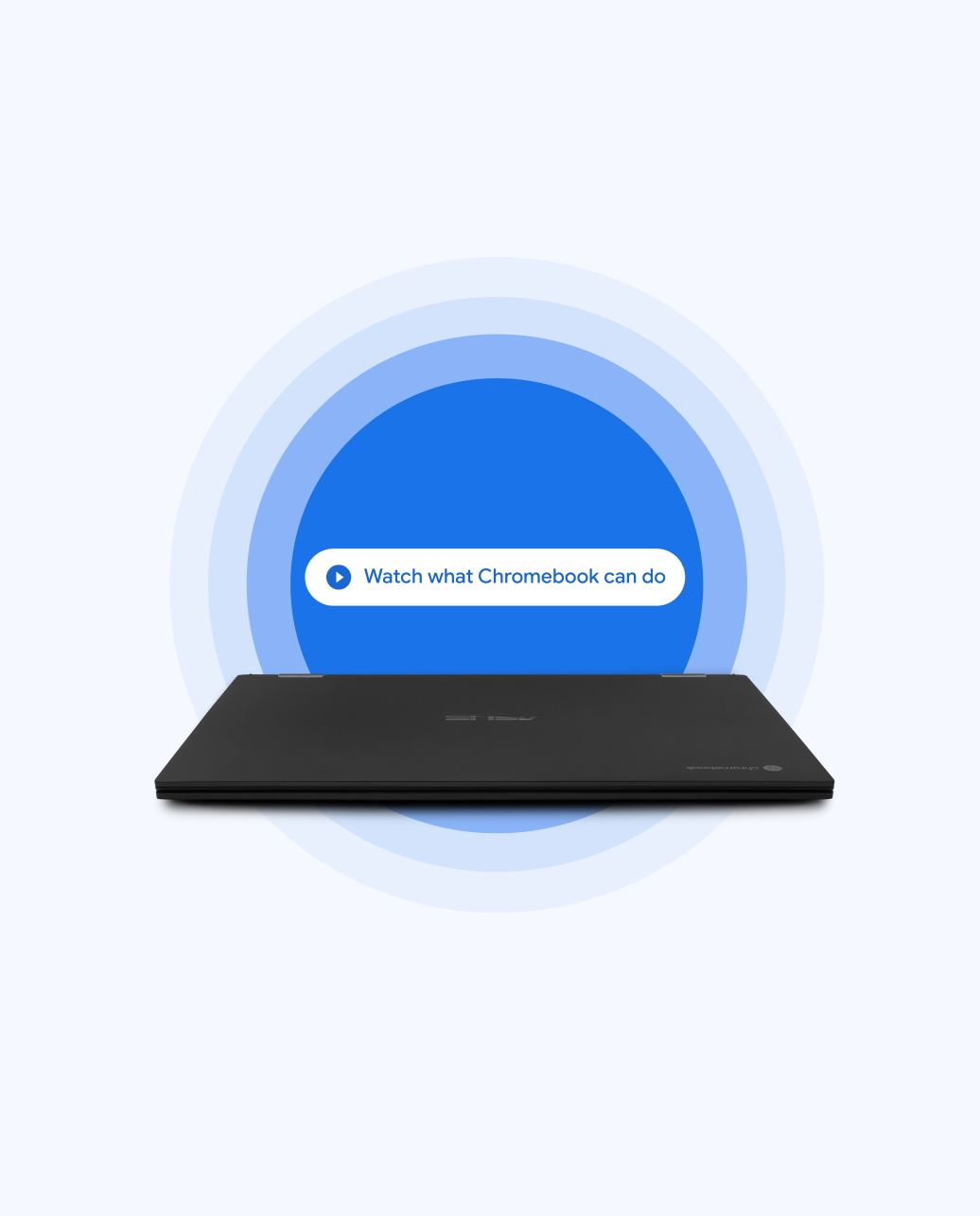
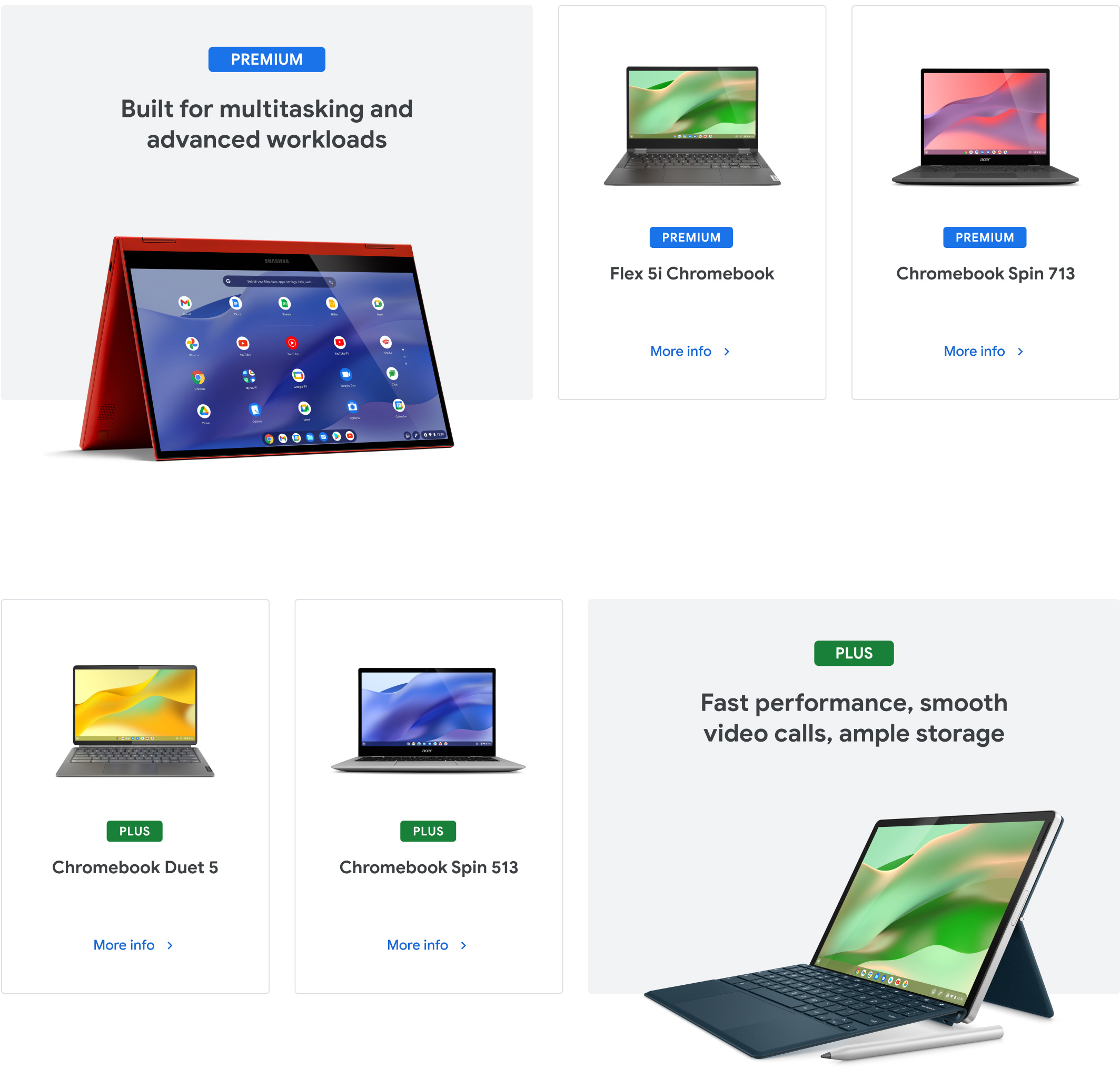
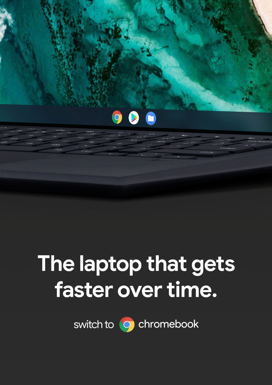
From getting stuff done on the move to at-home entertainment, there’s a Chromebook that matches your lifestyle.
Client
Industry
Technology
Role
Associate Design Director
Deliverables
Digital Strategy
Information Architecture
Wireframe + Prototyping
User Journeys
Visual Design
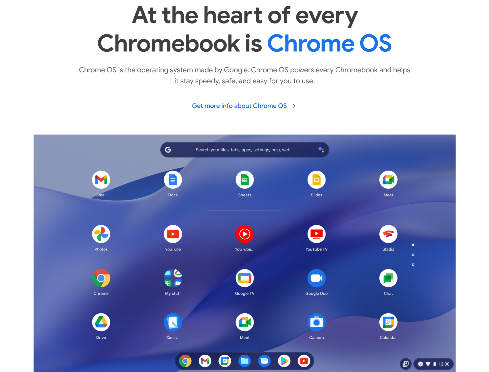
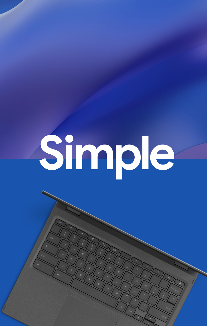
Starts fast, stays fast. Secure to the core. Simple setup, easy to use.
Chromebook is a cloud-first laptop that runs Google’s Chrome OS. What’s that mean? Exactly, neither do we. Guidance and tools make the page slow and confusing.
Our Goal
Make it easier for our users.
Chromebook should deliver a more delightful, helpful user experience with clear, concise guidance for every user interested getting a Chromebook.
We focused on four key areas to better understand and identify the opportunities for the new Chromebook experience.
Content review.
Exploration of client provided resources including analytical findings, processes, previous HaTS survey, and more.
Stakeholder interviews.
We talked with both Googlers and users who utilize the site—either for the purpose of buying Chromebooks or using them.
Site audit.
We took a deep dive into the site itself, evaluating the breadth of content, types of components and current information architecture & navigation.
Landscape exploration.
Currently an ongoing effort, we have been looking for Chromebooks, both in- and out-of-category, to get a sense of how others are organizing theirs.
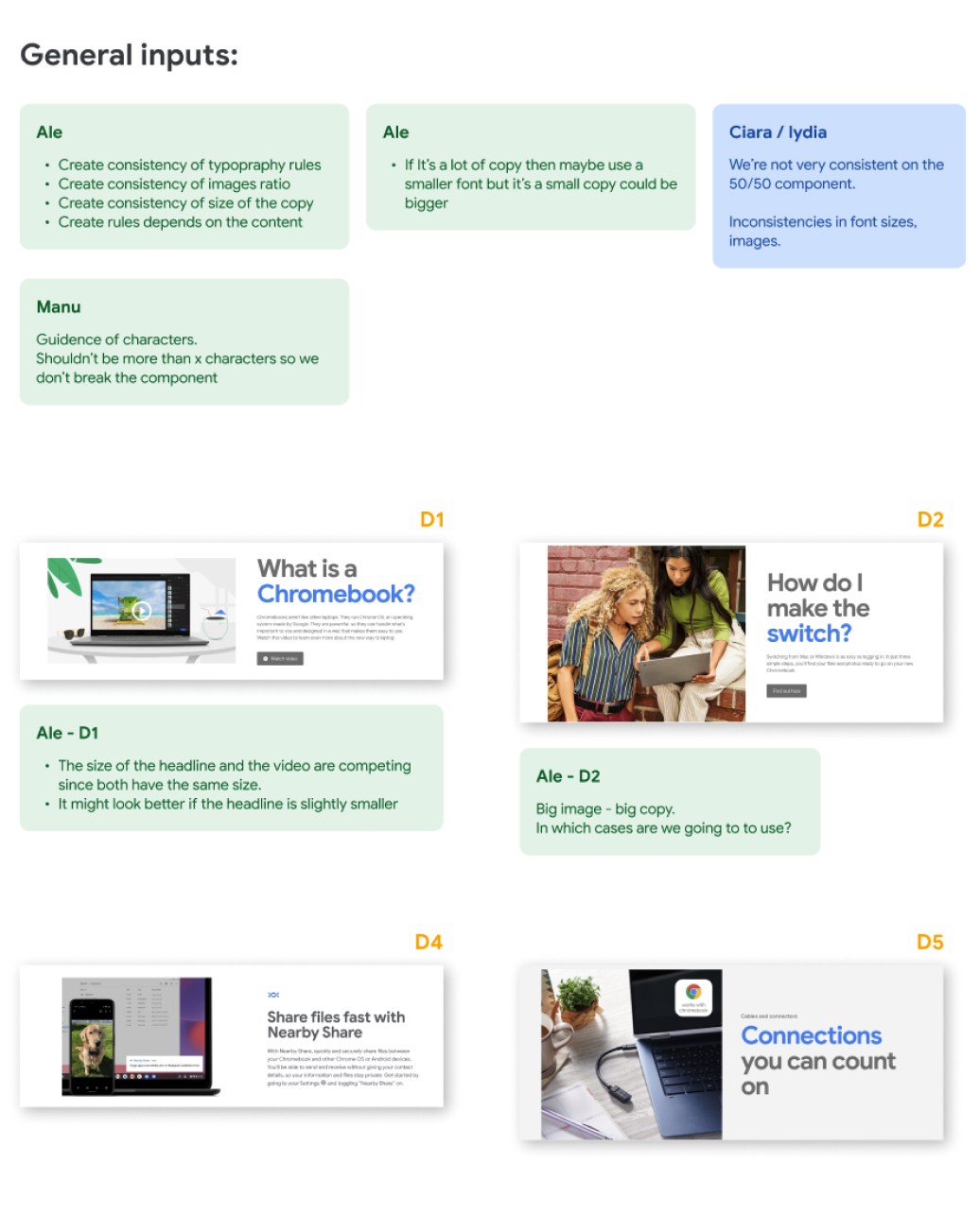

What we heard on interviews:
“Chromebooks started as a market alternative, but as we’ve matured as a company, we added a wealth of brand, marketing, and commitments content and grown past the identity structure we are in.”
James Cwiek, Brand Manager
“Details that you need to know are hidden and I found myself relying on table of contents to get an idea of what is there.”
Anna Stanley, User
“The homepage should speak to everyone. It should say, "You work deserves a Chromebook, there is the right one for you."
Lucy Brendan, Group Lead
Findings
Homepage should inform & inspire.
The homepage does not help our audiences understand the full breadth of devices available to them.
Our current state offers different sections that neither tell a cohesive story nor inform specific users about which parts of the site will benefit their needs.
Processes can be optimized.
- Educate users on the Brand.
- Empower users to find what they need.
- Inspire users to create awesome work.
Educate users on the Chromebook brand.
The content on the site should be clear and concise. It should educate users on the brand foundations, and offering insights into the perks of owning a Chromebook.
Empower users to find what they need.
Our navigation system and experience should offer users the ability to locate the information they need, quickly and easily. If we are able to give them clear paths, our audience will not waste time trying to understand their options and are less likely to drop off and search for what they need elsewhere.
- New information architecture
- Updated navigation
- Better cross-linking
- Quick links/Most popular
- Personalization
Strategy
Easy to use/want.
In order to entice users to scroll and see all the information available on the page, we should make the layout more attractive and useful.
Clear purpose.
Users should not only be able to understand the site’s purpose, but also, the essence of the brand—its expression, tone and voice, and more.
Progressive disclosure.
The goal is not to expose all the content on the homepage, but rather, to progressively guide users to the information they are looking for.
Adapt to users.
The homepage should be a reflection of the content of the site and the needs of the user. If these changes, the homepage must be able to do so as well.
Design does not sell itself. The key to winning over users is by offering great content.
Tactics
IA & navigation.
We first explored the current information architecture and top navigation. The two main goals of this exercise were to (1) understand the amount of content we have on the site—a whopping 491 pages—and (2) help us see the hierarchy and organization of the information.
Pages & layouts.
Next, we looked at the different page types throughout the site and their various uses. Aside from the homepage, we have overview pages and detail pages that host the different guidelines, collections and more.
Existing components.
Understanding the components available will help UX and designers when creating the new vision for Standards. It will ensure we are able to host all the same content and opens up opportunities for additional component exploration and expansion.
What we were looking for:
- Navigation experiences that prevent nesting
- IA’s that made sense to user needs
- Strong pages narratives
- Engaging experiences
- Brand guidelines
- A way to promote updates & new content
Different download experiences
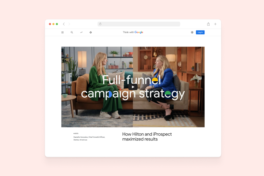
Visual design and interaction tactics
- Starts with an inspirational brand moment (video) at the beginning.
- Simple, clear intro that explains exactly what the portal’s purpose is.
- Nicely designed module that shows how the brand is brought to life through different verticals.
- Highlights key brand identity elements.
- Simple, clear key messages.
- Z reading structure that facilitates the natural reading pattern.
- Delightful micro-interactions.
- Great use of imagery, text, hover states and scroll actions.
This page has not yet been released, and we are waiting to be launched this year to know the results of all the research and design work in which we were involved last year.

More case studies