Partner with Rimac to orchestrate their mobile ecosystem and boost their growth and engagement in the insurance industry through the years to come.
Client
Rimac Seguros
Industry
Insurance company
Role
Content Strategyst
Lead Designer
Deliverables
Digital Strategy
Information Architecture
Wireframe + Prototyping
User Journeys
Visual Design
Embrace a product design and development process based on real user validation and incremental learning.
Rimac is the biggest insurer in Peru and one of the most important in Latin America.
People's perception of the insurance industry is that they appear once a year when the client have to pay for their yearly subscription or when a calamity occurs.
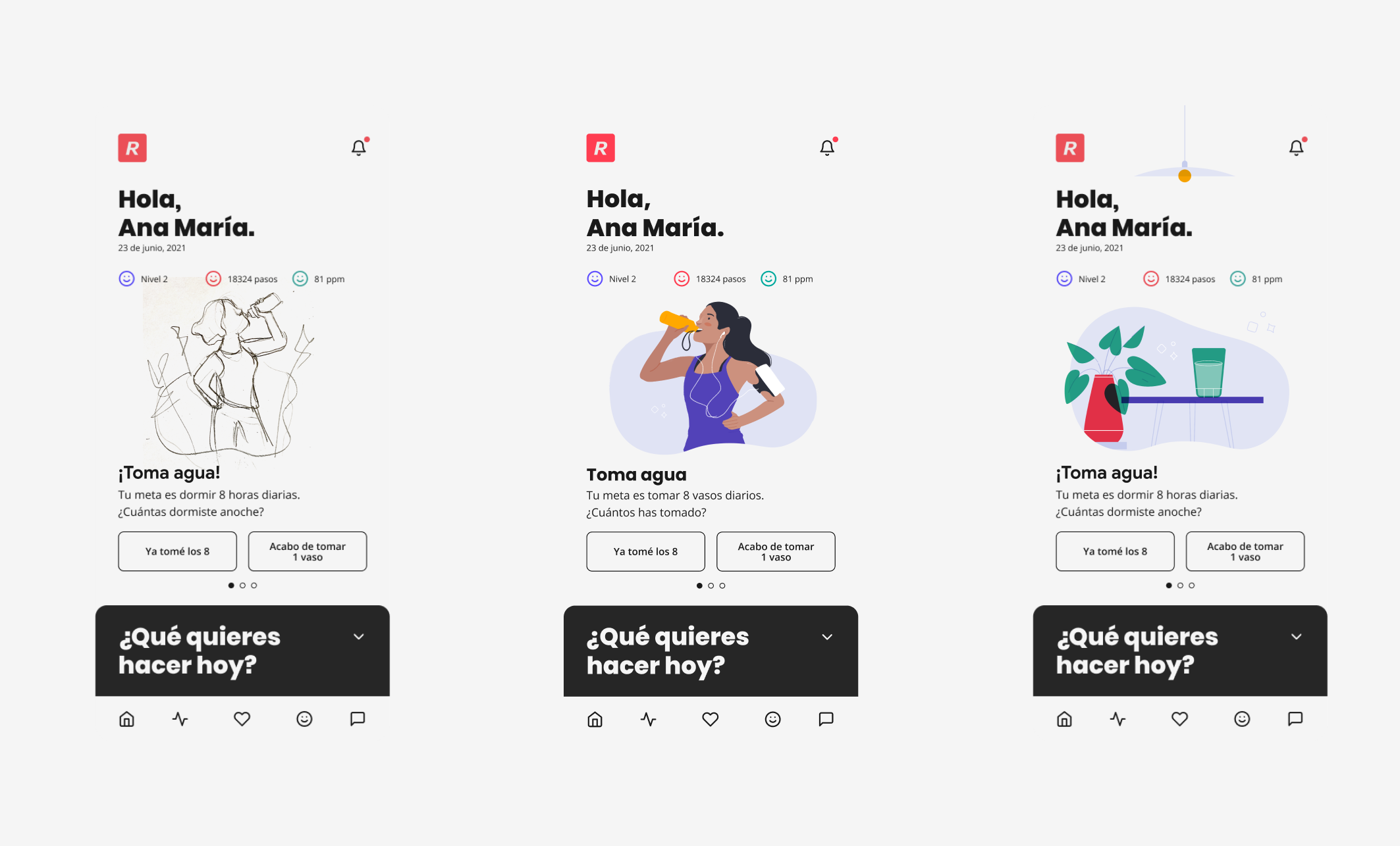
Rimac wants to change this perception and, based on a digital experience, intends to offer services linked to the health and well-being of its users. For more than a year and a half, we worked to make this experience a reality.
Objectives
- Increase the number of users who use the RIMAC APP and are already clients of the insurer.
- Increase the satisfaction of RIMAC App users.
- Create an ongoing day-to-day relationship between RIMAC clients and the company through the App.
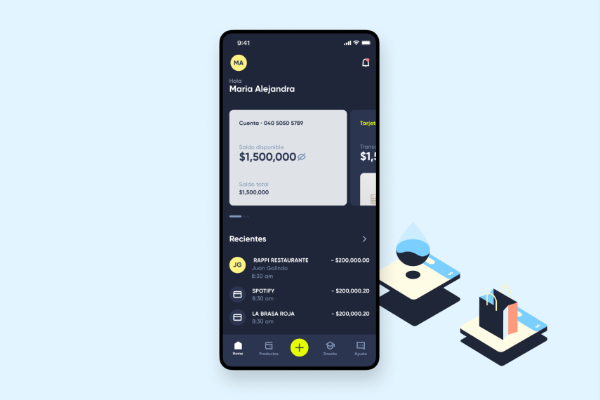
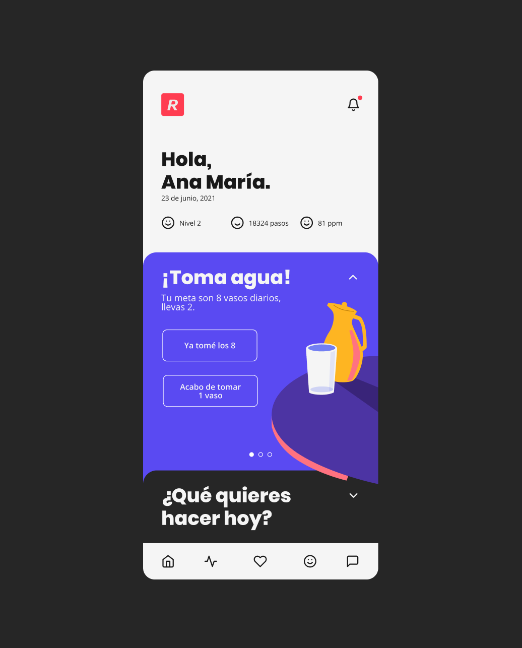
As a team, we go through all the stages of product design, doing user research, interviews, wireframes, prototypes, user testing, and visual design. Once we launched the product, we had the opportunity to iterate and keep improving the whole experience.
Understanding user needs
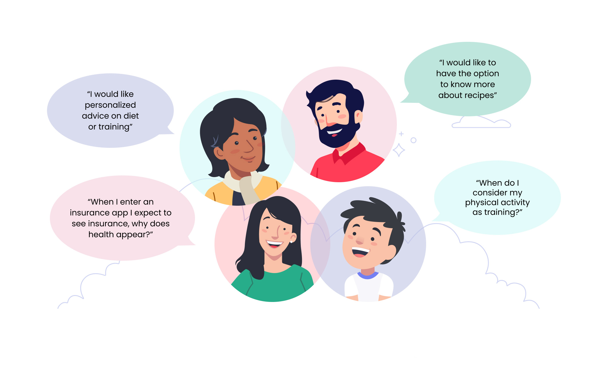
We had to be sure that people would find valuable the app value proposition. We took a sample of 10 Rimac client users (or ex-clients) with health insurance between the ages of 20 and 55 and who had dependents (children or parents).
In this sample, we presented the value proposition and some wireframes that supported the experience. While the main idea still had room for improvement, users found it very valuable and worth moving forward.
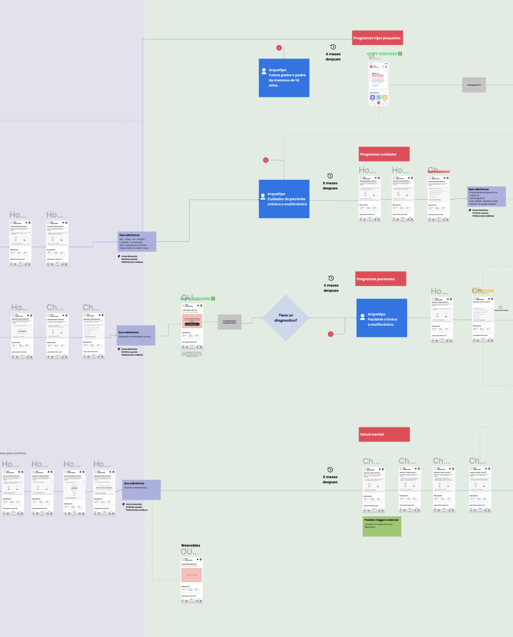
Finding patterns
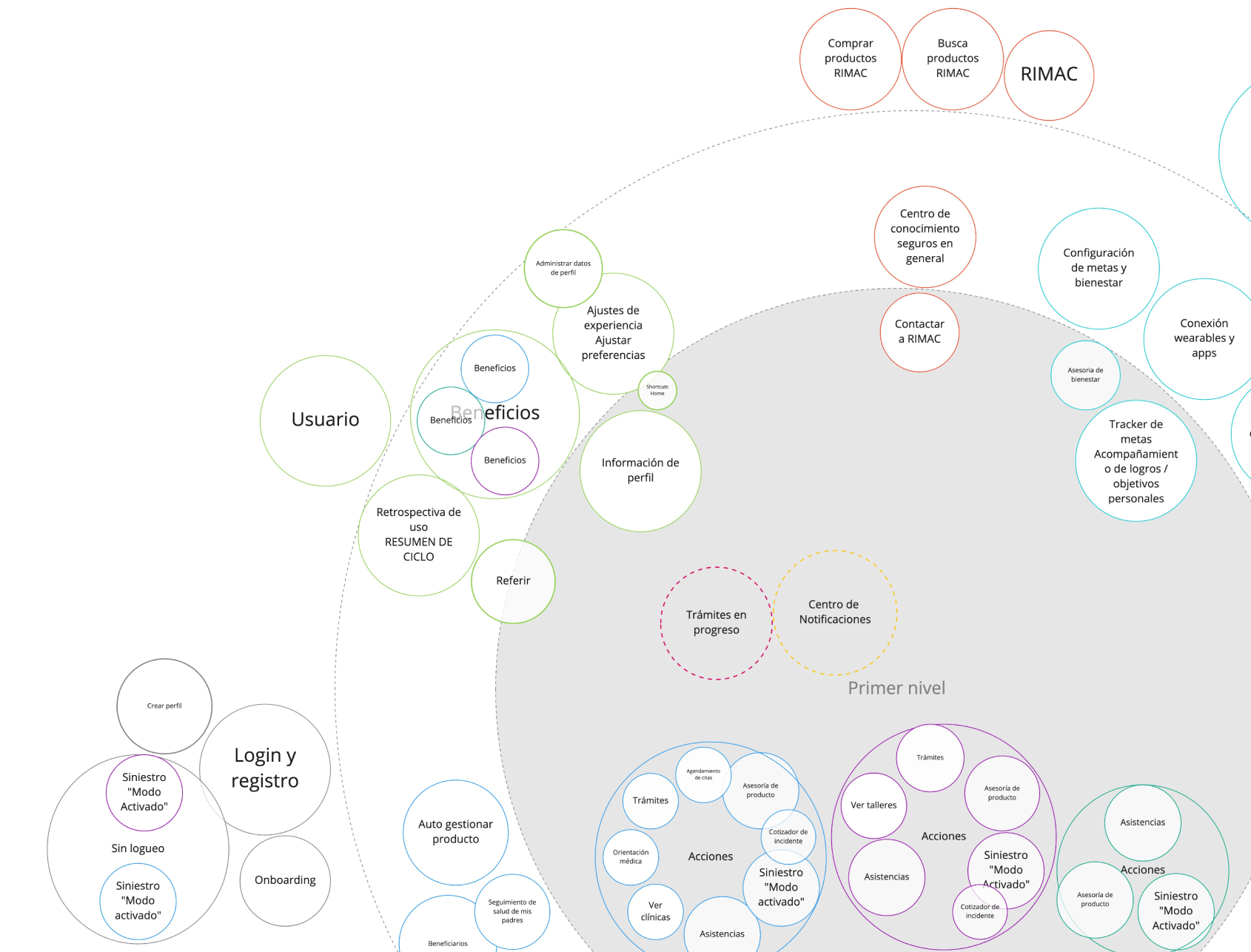
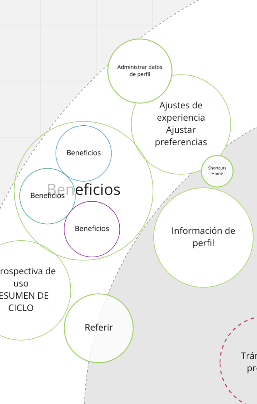
From the fundamental research and ideation process, we identified areas, concepts, and ideas that would be repeated throughout the project. We group and categorize them to understand user behavior understanding their search criteria and priorities.
Designing the experience
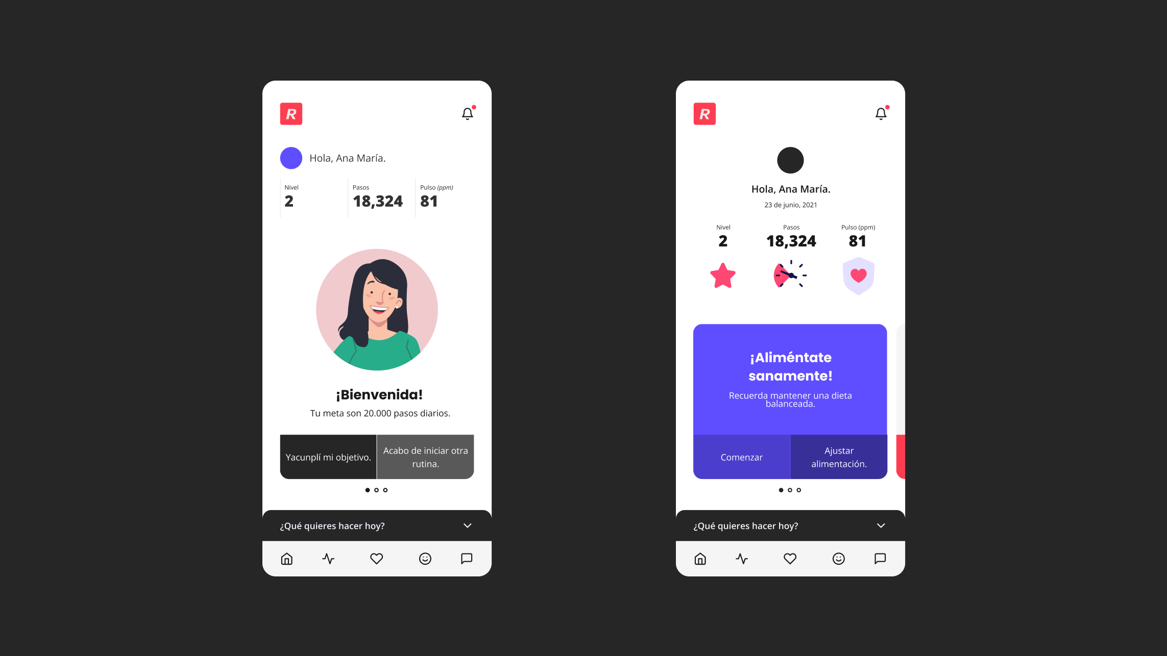
To guide the team toward making appropriate decisions, we worked tighter to bring the company spirit to digital product design. That’s why we created the “Rimac App Design Principles.” From there, we were prepared to start designing the user journey.
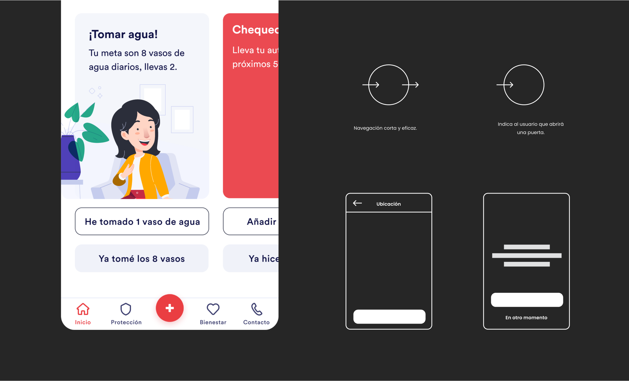
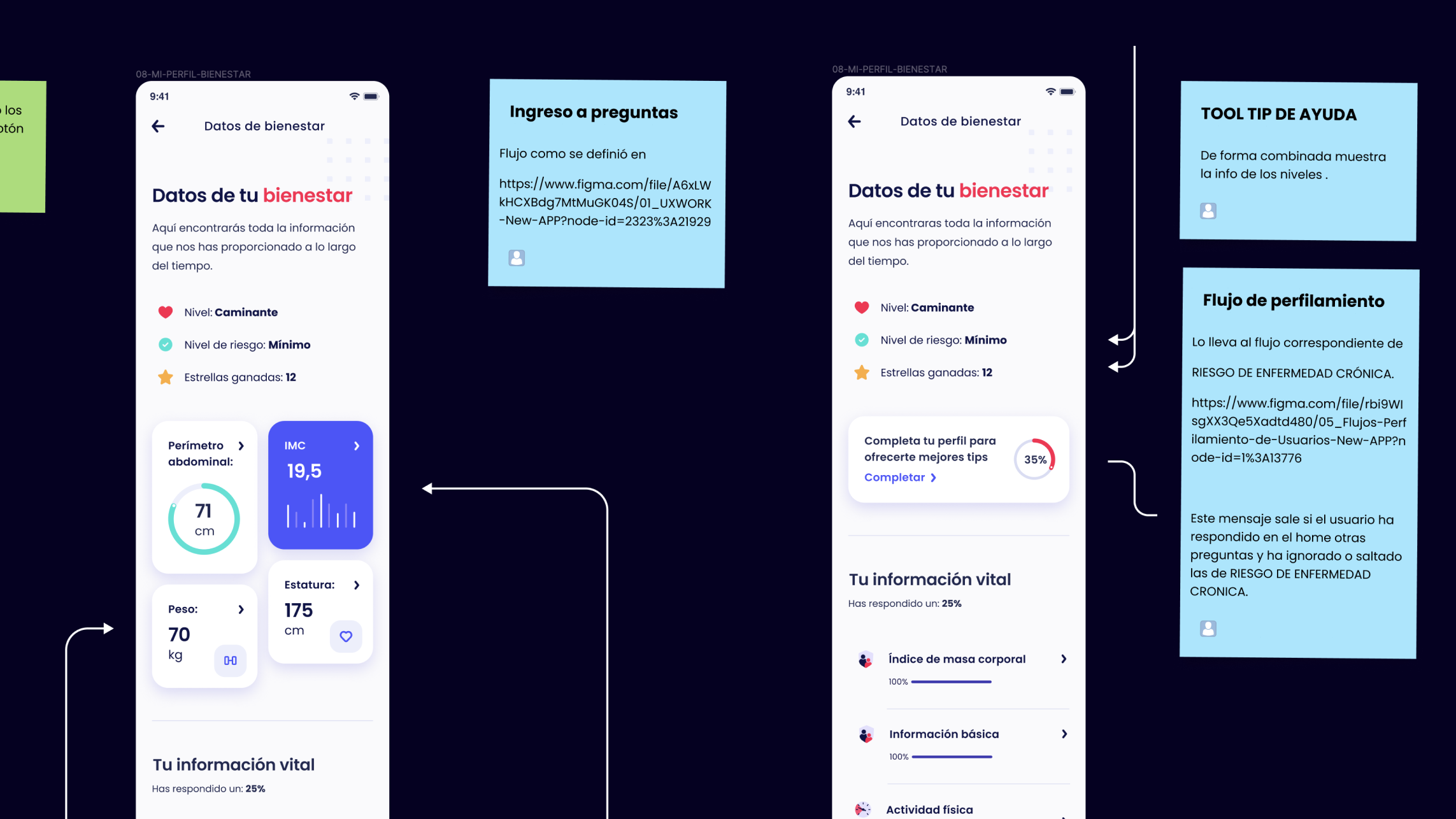
We divide the Journey into three chapters to made it easier to design the whole experience. We created more than 30 screens; after the first user testing sessions, we realized we were complicating the experience and had to go back to the initial idea. Since then, we kept working, testing, and iterating until we felt confident that the product was ready to start the visual design phase.
*(due to restrictions, I can't post photos of user testing sessions).
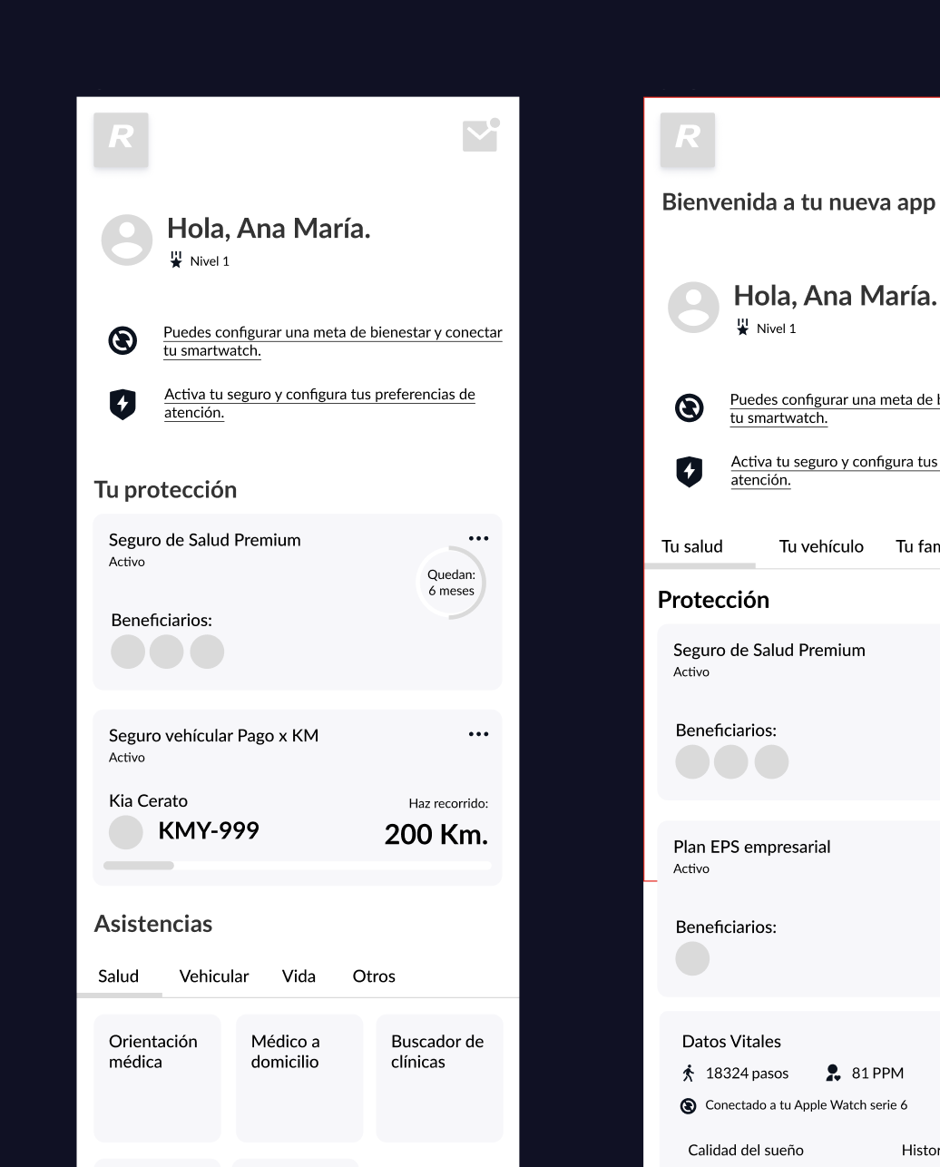
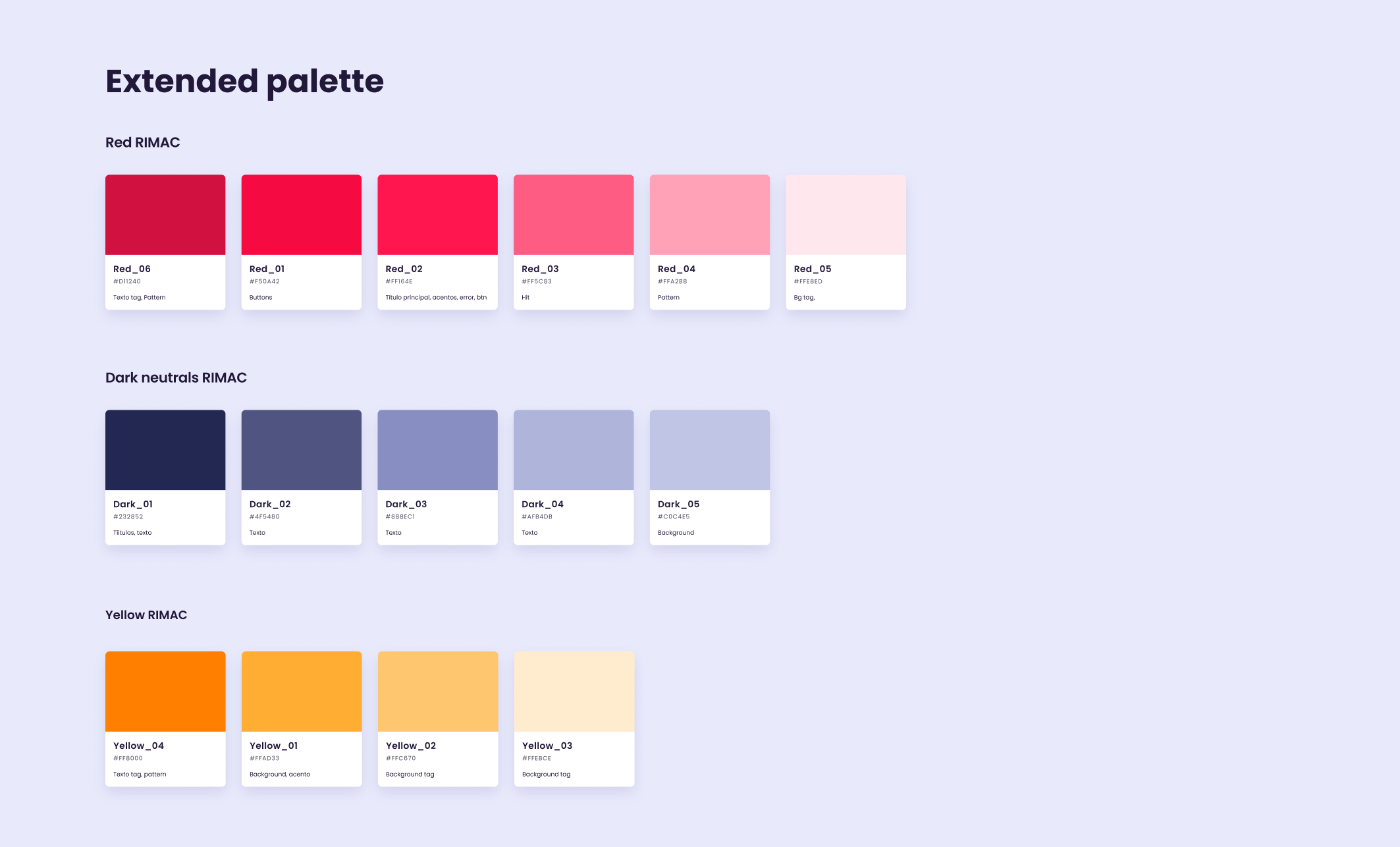
Design System
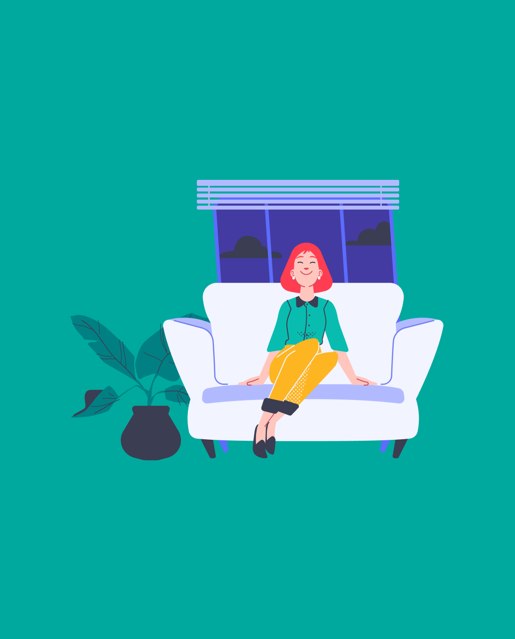
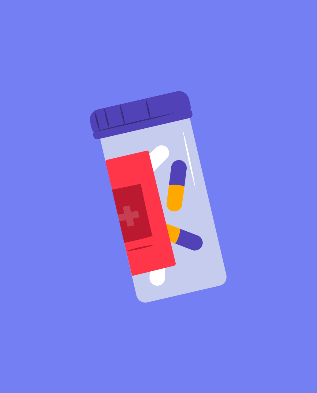
Assuming that the visual ecosystem of the brand has endured over the years, we decided to make subtle changes to the colors and typography to comply with the best accessibility practices, but without the client feeling that their identity was being lost. Regarding the illustrations, we present a proposal to refresh users' perception.
Research into design
Visual testing and experimentation. This research was centered on understanding what is on the market, what our users expect from the service, and how we can have an honest conversation with them. We explore from visual grammar and design literacy (research through making) to the relationship between audience and message and the investigation of context and processes.

Conclusions
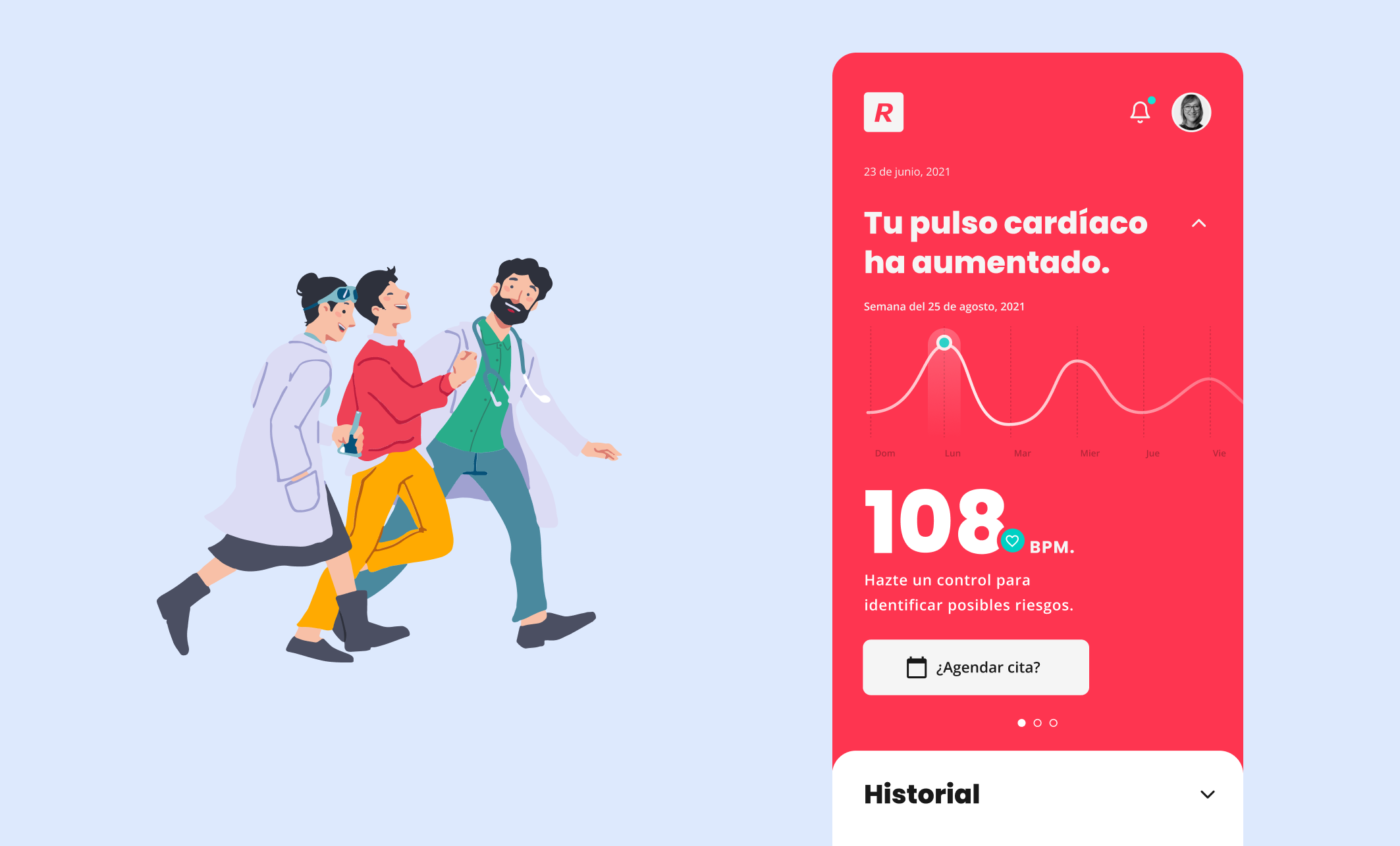
The app has the opportunity to use knowledge about the user and their external context to proactively advise and be present at the moments of most significant relevance and value to their lives.
The application currently has thousands of recurring monthly users and is a success story in digital products in the insurance industry in Latin America.
The constant iterations in the User Flows and the testing (sometimes of minimal things) allowed us to improve our processes and become more and more efficient. This work in the early part allowed us to feel very sure that the product had the conditions to succeed.
More case studies